
Dental Website Conversion Checklist
21 elements your dental website needs to convert visitors into patients. Practical tips you can implement today.
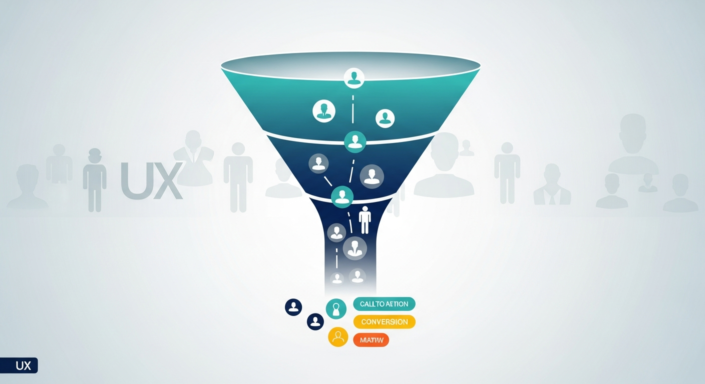
Your dental website gets traffic, but those visitors aren't becoming patients. Sound familiar?
You're not alone. The average dental website converts just 2-3% of visitors into leads. That means 97 out of every 100 people who find your practice online leave without calling, booking, or even filling out a form.
The good news: website conversion isn't mysterious. It comes down to specific, measurable elements that either build trust and encourage action—or create friction and drive people away.
This checklist covers 21 elements your dental website needs to turn casual browsers into scheduled patients. Use it to audit your current site or as a blueprint for your next redesign.
Above the Fold: The 5-Second Test
Visitors decide whether to stay or leave within seconds. Everything visible before scrolling must answer three questions: Who are you? What do you do? Why should I choose you?
1. Clear Value Proposition
Your headline should state exactly what you offer and who you serve. Generic phrases like "Quality Dental Care for the Whole Family" don't differentiate you from the hundred other dentists in your area.
Better alternatives include specifics: "Same-Day Emergency Appointments in Downtown Austin" or "Sedation Dentistry for Anxious Patients." Tell visitors what makes your practice worth their time.
Quick fix: Rewrite your homepage headline to include your location, specialty, or unique differentiator. Test it with someone who doesn't know your practice—can they explain what makes you different after reading just the headline?
2. Prominent Phone Number
Your phone number should be visible within the first two seconds of landing on any page. Use a large, clickable format that works on mobile. Consider adding "Call Now" or "Book Today" text next to it.
Quick fix: Add your phone number to the top right of your header in at least 18px font. Make it a clickable tel: link for mobile users.
3. Primary Call-to-Action Button
One clear action should dominate above the fold. Whether it's "Schedule Your Visit," "Book Online," or "Request Appointment," the button should be visually distinct and impossible to miss.
Avoid competing CTAs. If you have three buttons above the fold all asking for different things, visitors freeze with indecision.
Quick fix: Choose one primary action and make that button your boldest color. Secondary options can exist but should be visually subordinate.
4. Professional Hero Image
Stock photos of smiling models signal "generic dentist." Photos of your actual office, team, or real patients (with permission) signal authenticity and build immediate trust.
If you must use stock photography, choose images that feel natural and relatable—avoid the perfectly-lit-family-all-with-perfect-teeth cliché.
Quick fix: Schedule a professional photoshoot. The investment pays for itself many times over through improved conversion rates.
5. Location Visibility
Visitors want to know you're actually near them. Include your city or neighborhood name prominently above the fold—in your headline, subheading, or a visible location badge.
Quick fix: Add a "Serving [Your City/Neighborhood]" line near your headline or in your navigation bar.
Trust Signals: Proof That You're Worth Choosing
Dental decisions are high-stakes. Patients are entrusting you with their health, comfort, and appearance. Every element of your site should reinforce that you're trustworthy.
6. Google Reviews Integration
Display your Google rating and review count prominently. If you have 4.8 stars across 200+ reviews, that's powerful social proof—don't hide it in a footer link.
Consider embedding actual review snippets that address common patient concerns: fear of pain, cost transparency, friendly staff.
Quick fix: Add a reviews section to your homepage showing your star rating, total review count, and 3-5 selected testimonials.
7. Before/After Gallery
For cosmetic and restorative services, visual proof matters more than any description. A gallery of real patient transformations—with proper consent and consistent photography—demonstrates your clinical skill.
Quick fix: Start photographing cases now with consistent lighting and angles. Even 5-10 quality before/after pairs significantly impact conversion.
8. Doctor Credentials and Story
Patients want to know who will be working on their teeth. Include professional photos, credentials, and a brief personal story that helps visitors connect with your doctors as humans, not just providers.
Quick fix: Write a 200-word doctor bio that balances credentials with personality. Include where you trained, why you became a dentist, and something personal (hobbies, family, community involvement).
9. Professional Affiliations and Certifications
Display logos for dental associations, advanced certifications, and continuing education achievements. These signal competence and commitment to staying current.
Quick fix: Create a visual "Affiliations" section with 4-6 logos for organizations like ADA, your state dental association, and any specialty certifications.
10. Office Environment Photos
Anxious patients want to see what they're walking into. Show your waiting room, treatment areas, and technology. Clean, modern, welcoming environments reduce anxiety and build confidence.
Quick fix: Include an office tour section or photo gallery that shows your space from a patient's perspective.
Forms and Conversion Points: Reducing Friction
Every form field, every extra click, every moment of confusion costs you patients. Conversion optimization means removing every unnecessary barrier between interest and action.
11. Short Appointment Request Forms
The ideal form asks only for what you absolutely need: name, phone, email, and preferred time. Every additional field reduces completion rates.
If you need more information, get it during the follow-up call—not on the initial form.
Quick fix: Audit your forms. If you're asking for more than 5 fields, cut everything non-essential.
12. Multiple Contact Options
Some patients want to call. Others prefer forms. Some want live chat. Offer multiple pathways and let visitors choose their comfort level.
Quick fix: Add a secondary contact method to your existing pages—if you only have a form, add your phone number prominently nearby.
13. Online Scheduling Integration
When someone decides they want an appointment at 10 PM, they should be able to book one. Online scheduling that shows real availability and confirms instantly removes the friction of phone tag.
Quick fix: Implement online scheduling software that integrates with your practice management system.
14. Click-to-Call on Mobile
Mobile users shouldn't have to copy your number, switch apps, and paste it. One tap should initiate the call.
Quick fix: Ensure your phone number uses the tel: link format so mobile browsers recognize it as callable.
Mobile Experience: Where Most Visitors Land
Over 60% of dental website traffic comes from mobile devices. If your site doesn't work flawlessly on phones, you're losing the majority of potential patients.
15. Responsive Design That Actually Works
"Mobile responsive" isn't just about fitting on a smaller screen. Navigation should be thumb-friendly. Buttons should be tap-sized. Text should be readable without zooming. Forms should be completable without frustration.
Quick fix: Test every page of your site on your own phone. Try to book an appointment. Note every point of friction and fix them.
16. Fast Mobile Load Times
Mobile users are impatient and often on slower connections. If your site takes more than 3 seconds to load, many visitors leave before seeing anything.
Quick fix: Run your site through Google PageSpeed Insights and address the top recommendations.
17. Thumb-Friendly Navigation
Mobile menus should be easy to open and navigate with one thumb. Important links should be large enough to tap accurately.
Quick fix: Test your mobile navigation with just your thumb. If you struggle to hit links or buttons, your patients do too.
Speed and Technical Performance
Every second of load time costs conversions. Technical performance isn't glamorous, but it directly impacts whether visitors stick around long enough to become patients.
18. Page Load Under 3 Seconds
Use tools like Google PageSpeed Insights or GTmetrix to measure actual load times. Aim for under 3 seconds on mobile, under 2 seconds on desktop.
Common culprits include oversized images, unoptimized code, and slow hosting. Each is fixable.
Quick fix: Compress all images to web-optimized sizes. Consider upgrading to faster hosting if your site is sluggish despite optimized content.
19. Optimized Images
Large image files are the most common cause of slow dental websites. Every photo should be compressed and properly sized for its display context.
Quick fix: Run existing images through a compression tool like TinyPNG before re-uploading them.
20. SSL Security Certificate
Your site should use HTTPS, indicated by the padlock icon in browsers. Without it, visitors see security warnings, and Google penalizes your search rankings.
Quick fix: Most hosting providers offer free SSL certificates. Enable yours if you haven't already.
21. Working Links and Forms
Broken links and forms that don't submit erode trust instantly. Test every link, button, and form on your site regularly.
Quick fix: Use a tool like Screaming Frog or manually click through your site to identify and fix broken elements.
Putting It All Together
No single element on this list will transform your website overnight. Conversion optimization is cumulative—each improvement adds to the others, creating an experience that guides visitors naturally toward becoming patients.
Start by auditing your site against this checklist. Score each element: Does it exist? Does it work well? Is it optimized? Prioritize fixes based on impact and effort.
If your website is missing multiple elements from this checklist, or if the fixes feel overwhelming, it might be time for a professional website audit. At Brandside Digital, we specialize in dental websites built specifically for conversion—not just aesthetics.
Frequently Asked Questions
How do I know if my website conversion rate is good or bad?
The average dental website converts 2-3% of visitors into leads (form submissions or calls). Anything below 2% indicates significant room for improvement. Well-optimized sites can reach 5-8% conversion rates. To measure yours, divide your monthly leads by your monthly unique visitors. If you don't have tracking in place, that's the first thing to fix.
Which elements have the biggest impact on conversions?
Above-the-fold clarity, mobile experience, and page speed typically have the most immediate impact. If visitors can't quickly understand who you are and how to contact you—or if the site is slow and frustrating on mobile—everything else becomes irrelevant. Start there before optimizing trust signals and form design.
How often should I update my dental website?
Content freshness matters for both SEO and patient perception. At minimum, update your site whenever information changes (new doctors, new services, new locations). Beyond that, plan quarterly reviews of your analytics to identify underperforming pages. Major redesigns every 3-4 years keep your site current with design trends and technology standards.
Should I try to fix these issues myself or hire a professional?
Simple fixes like updating phone numbers, compressing images, or rewriting headlines can often be handled in-house. More complex issues—page speed optimization, mobile experience overhauls, form integration, and overall conversion strategy—typically benefit from professional expertise. The cost of a poorly-optimized website is measured in lost patients, which usually exceeds the investment in professional help.
Ready to see how your website measures up? Contact us for a free website audit and get specific recommendations for turning more visitors into scheduled patients.
Ready to grow your practice?
Let's discuss how these strategies can work for your practice specifically.
Book a Strategy Call